Atomic line plots (optical electron emission plots) for atomic emission spectroscopy
To visualize all atomic lines of an element we introduce a tool I call atomic line plot. To make it we collect all atomic lines of a specific atom or ion in a matrix where row(y-coordinate) corresponds to energy level of the upper state and column(x-coordinate) to the difference of the energy between lower and upper state i.e. the wavenumber and we put in the probability of the transition . When there are multiple lines close enough they end up in the same "pixel" we sum the values for the total probability. An emission spectrum can then be calculated as a weighted sum of the rows of the matrix.
For those readers curious about electron shell behaviour for some atomic lines mentioned I spell out the transitions as upper shell->lower shell for example "4s 2S->3p 2P" in the aluminium example below. Which shells are involved is not really important so ignore the markings if you don't care about them.
Aluminium atomic lines plot
Let's start with an example plot of aluminium non-ionized atom. We collect the values from our reference lists and draw it as a scatter plot in figure 1 and matrix heatmap in figure 2.
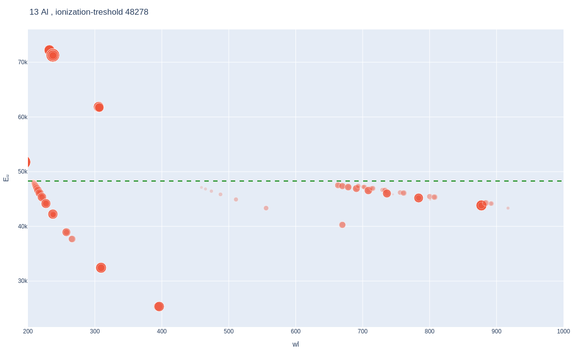

Best peaks for LIBS analysis are those of low upper energy so they are excited in low temperatures and high transition probability . So for aluminium this would be the doublet peak at 396.2 and 394.4 nanometers corresponding to 4s 2S->3p 2P transition and at 309.3 and 308.2 nanometers corresponding to 3d 2D->3p 2P transition. Experimental data in chapter XX agrees these peaks are the most prominent in our measurements. With aluminium we can see some of first ion Al peaks as well, for example a triplet peak 704.2, 705.7 and 706.4nm from s4p *3P->s4s 3S transition.
For the matrix format to later get efficient calculations, and to make the features better visible in the heatmap as well, we fatten the matrices with voigt(gaussian) profile before generating the spectra
Spectrum calculations with atomic line plots
This matrix is a powerful tool for calculations. To build up a theoretical atomic emission spectra we sum over the rows multiplied by the energy state population distribution we obtain from sum of Boltzmann distributions of different temperatures. This gives us the atomic line intensities in a vector. To make it look like what we see in experimental measurements we take a convolution of a Voigt-profile , or in most cases Gaussian is just as good, over the atomic lines to build a spectrum. To put this all in one we get equation 1 below, but in practice we make the parts separately.
Understanding the parts of this is vital to understand atomic emission spectra so let's look closer.
How these formulas can be used to calculate element concentrations from LIBS spectra is spelled out in section 3.3. on elemental mapping.
Maximal spectrum and minimal spectrum
As useful edge cases we create what we call maximal spectrum and minimal spectrum. These are convenient for identifying unknown spectra both as a visual tool and in our calculations to match an experimental spectrum to a theoretical one. The idea of maximal spectrum is that it shows all atomic lines that can come from an element and conversely the minimal spectrum should show those atomic lines that we always see if an element is present.
A maximal spectrum, produced in reality by a high temperature and high electron density plasma, is where we sum all rows of our atomic line plot equally weighted. We can choose to sum first ion maximal spectrum to the same spectrum or keep it as a separate plot. These three spectra are in figures @fig:Almaximal1, @fig:Almaximal2 and @fig:Al_maximal3.


A minimal spectrum, produced in low temperature conditons, is produced by summing the lines by heavily weighing the lowest temperature contributions. The choice for the cut-off point of the minimal spectrum is a bit arbitrary and depends on your methodology whether you want to include only very low temperature atomic lines a bit further. For our purposes of laser-induced breakdown spectroscopy done with our LASOLIBS device we practical value is found to be a plasma of few thousand degrees.

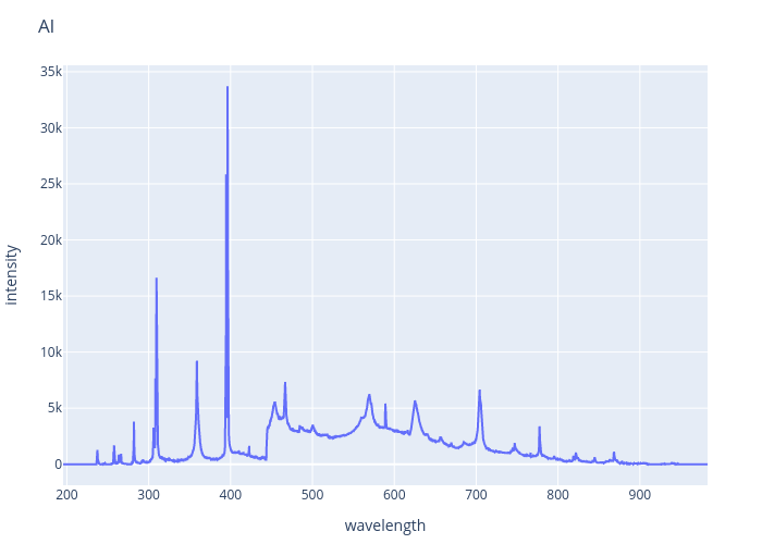
Compare all of the above to an experimental LIBS spectrum obtained from aluminum in figure.
Comparisons of reference atomic line lists using atomic line plots
These plots are a convenient way for us to check what a atomic line list has eaten. As the lists can be hundred of thousands of lines comparing them manually is not easy so let's make atomic line plots from them and compare the plots.
The three reference datasets we use, Kurucz, VALD and NIST ASD, are all huge and even though they all derive much from the same sources we want to see how similar or dissimilar they are in their essence of what is important for us. Which is to say what kind of spectra they predict. When the image looks the same, for our purposes the lists are equivalent. When there's big discrepancies it would be nice to understand why and which one is better. Better for us means better match with experimental data of our LIBS equiment.
Kurucz line list, VALD and NIST ASD based atomic line plots, again for aluminum, in figures X, X and X respectively. More elements are tested in a notebook on atomic line list comparisons.


Looking at the three figures
Let's also combine all the lists into one list and draw based on that

Example of mineral K-Feldspar line plot with aluminium, potassium, silicon and oxygen
Let's do one more complicated one to see how this would work for a potassium feldspar. Note that we cant distinguish between minerals of same element proportions such as between orthoclase and microcline.
Adding to the aluminium plot shown previously
A combination plot of all these elements with intensities multiplied by their atomic proportion in the mineral(KAlSi3O8)
After a parameter search for our plasma parameters matching the exparimental spectrum, as explained in later chapter xxx, we can build a better theoretical spectrum match.
Examples of use for explaining spectral behaviour
S
For sulphur only easy to see peaks with our equipment is a triple peak at 921.3, 922.8 and 923.7 nanometers all corresponding to 4p 4P-> 4s 5S transition. For equipment with deeper UV range other option is another triple peak 180.7, 182.0 and 182.6 nanometers all corresponding to 4s 3S->3p4 3P transition. Other peaks of base-state S require much higher excitation energies and thus higher temperature which leads to higher ionization damping the non-ionized S peaks.

Si
U
Uranium is difficult for our LIBS system. There's so many peaks in continuous fashion where none really stands out.

Unusual lines, Be
In the spectral libraries we have some outlier lines that are not result of the usual kind of electron shell transitions. These can be doubly excited states or other unusual transitions. One such example is visible in figure xx as an example of atomic lines that lie above ionization energy, beryl energy level 90181 1/cm for transition p3p 3P -> s3p 3P responsible at atomic lines around , when beryl ionization energy is only 75193 1/cm.
In LIBS spectra we are unlikely to see these as strong lines so normally we don't need to worry ourselves about them.