1976 Motocross action magazine◥
Early motocross racing was a movement that used modified bikes made for harsh terrains to race off-road. There was no specific lifestyle brands specialized in this type of racing, but rather the focus was on the bikes themselves: how to create a bike that is durable enough to face the challenges of the terrain? The few brands that were active at that time were mainly focused on aftermarket accessories, and had no broader visual identity.
The visual design was very simple, with advertisements and gear following standard advertising layouts of the time. The typography was mainly utilizing iconic typefaces like Gill Sans or Cooper Black, with no special type treatment that would be inspired by extreme sports.
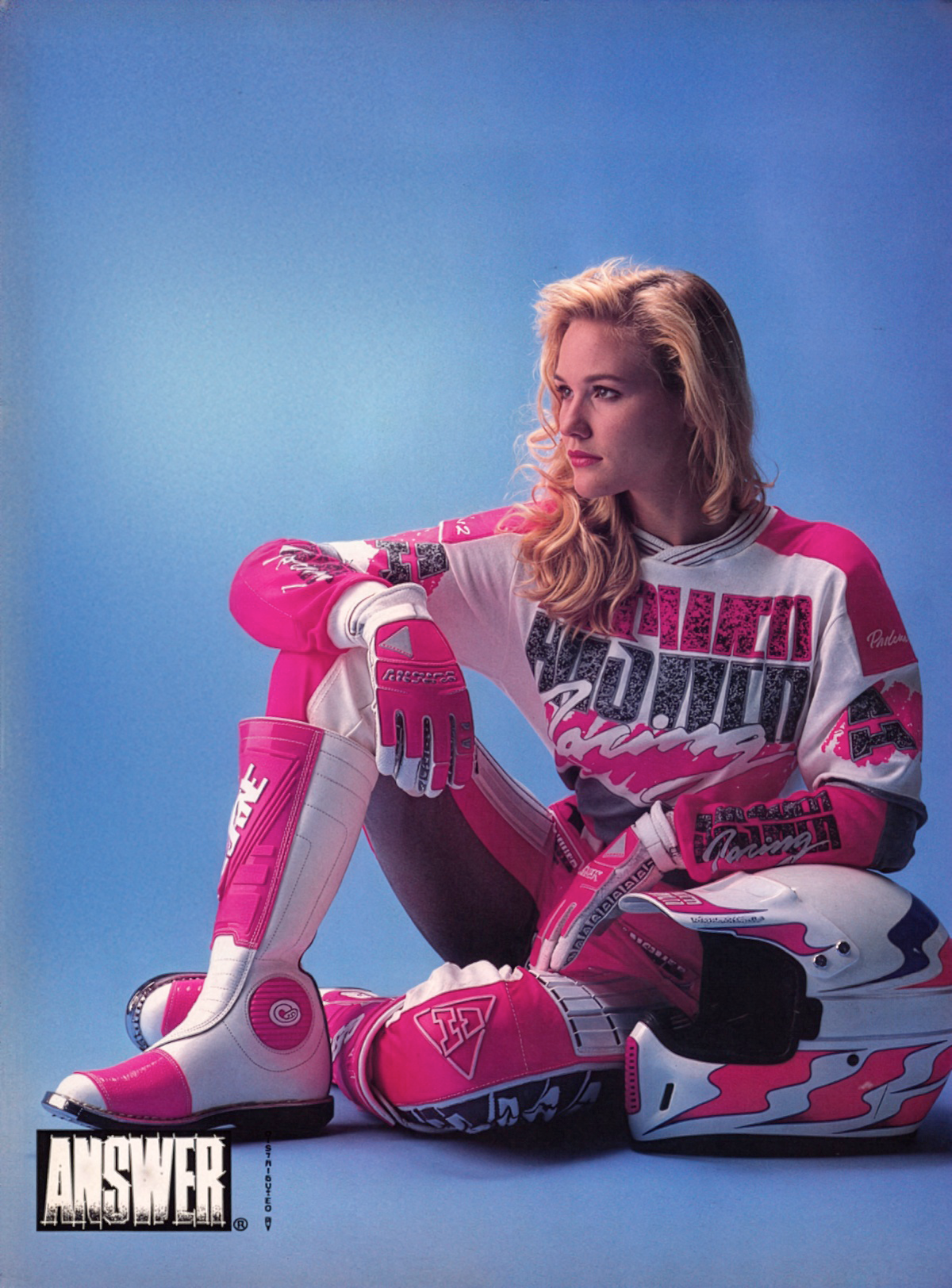
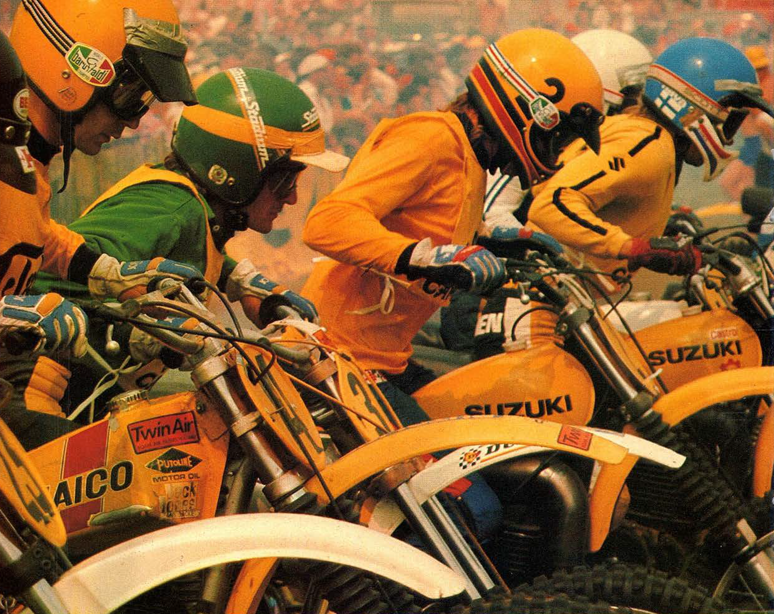
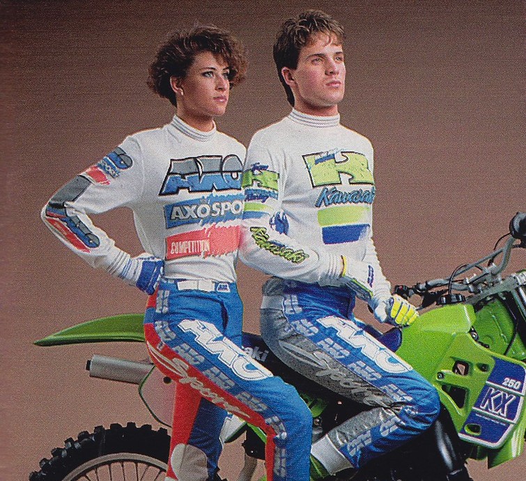
The 1908s saw the emergence of some products and designs that were specifically produced for the motocross sport, with some experimentation in regards to color and material. The garments were mainly inspired by icehockey, since the sport already manufactured padded clothing, moulded plastic components and utilized breathable materials.
The general esthetic however, was at this point still quite generic, with the typefaces and logos used on the apparel utilizing quite traditional placement. A jersey might have one central element on the chest, or pants might have a stripe down the leg, but no overlapping, contrast or multiplication of elements was present at this time, although some development was seen towards the end of the 1980s. Colors were utilized in large blocks, and usually followed traditional analogous or complementary combinations, mostly with one main (usually primary) color theme for the set.
Printing techniques were limited to screenprinting, which places an isolated design on the fabric with a surrounding margin. In other words, all-over prints were not common, nor technically executable, which means the 1980s jerseys usually had a white cotton appearance, with printed motives traditionally on the chest, arms and legs.
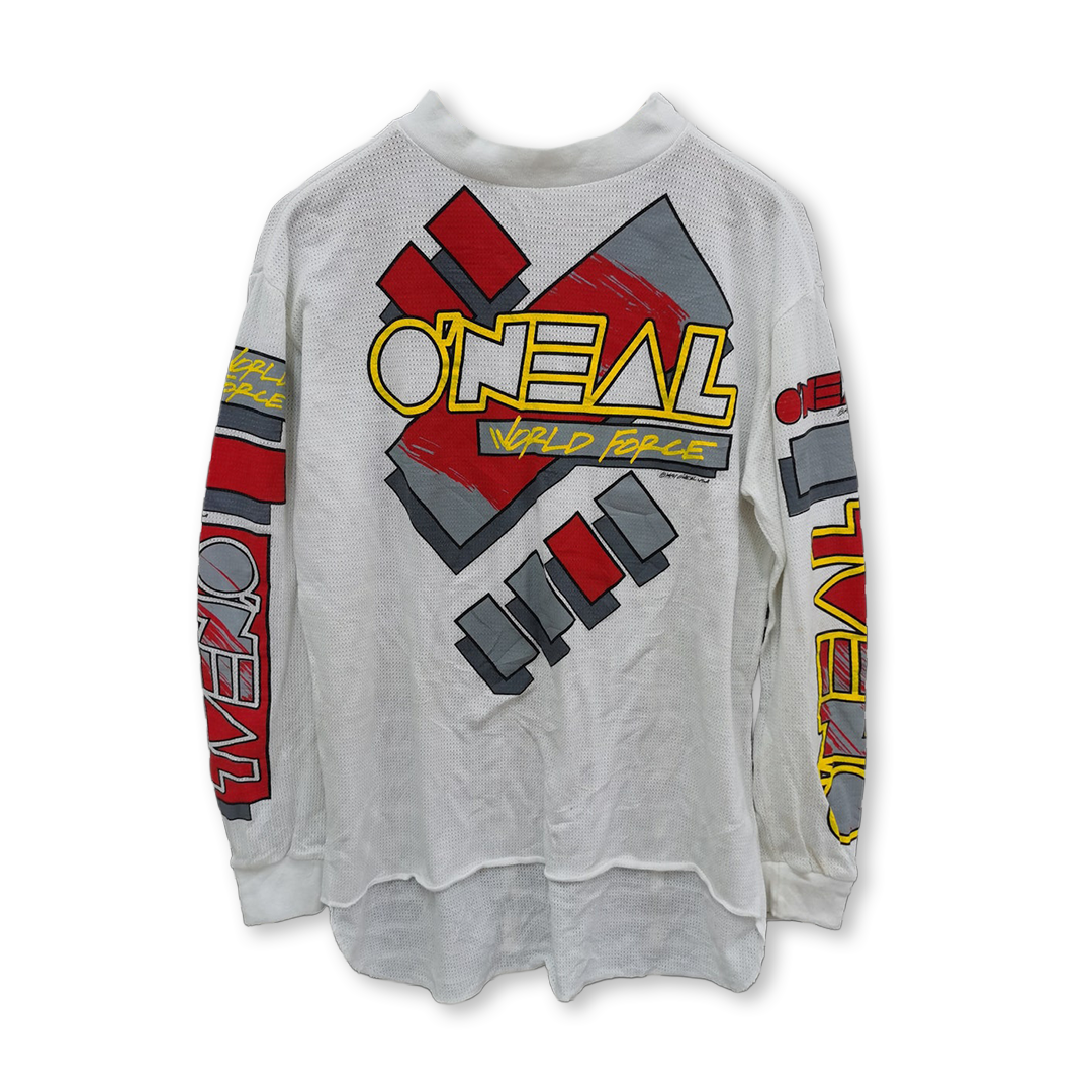
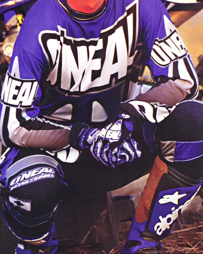
O'neal jersey 1991
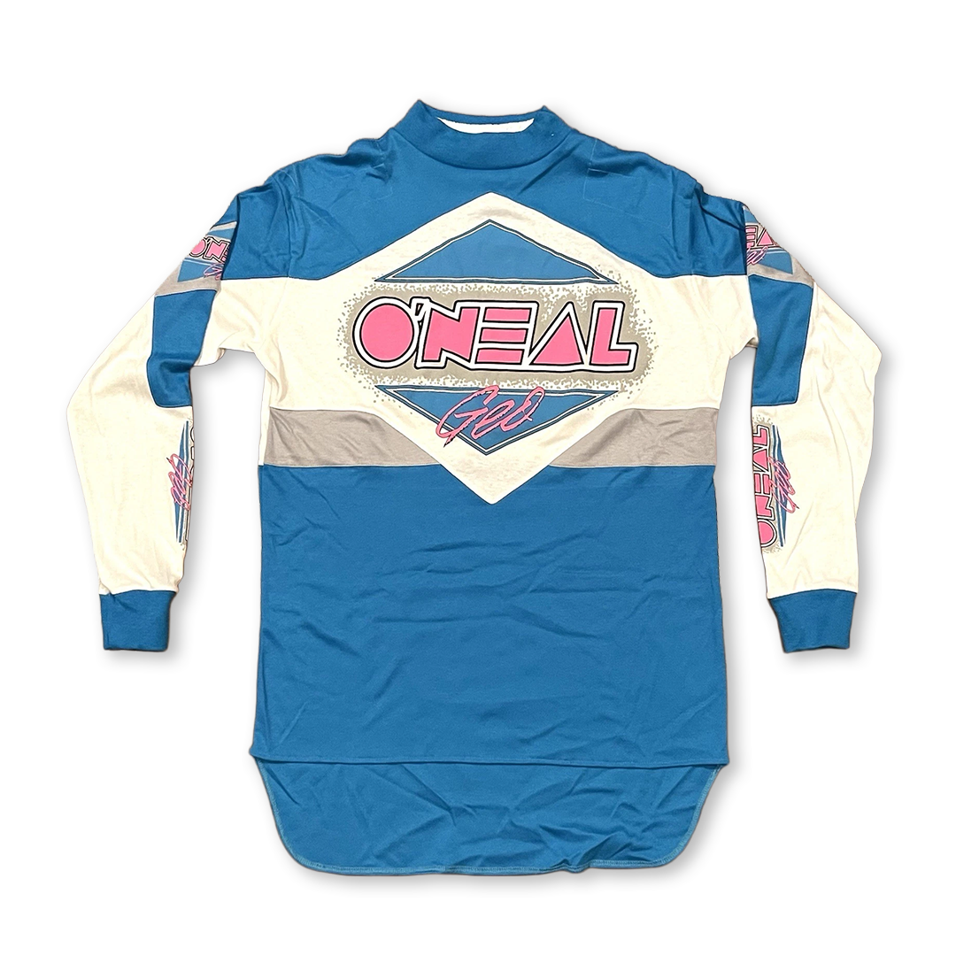
O'neal jersey 1980s
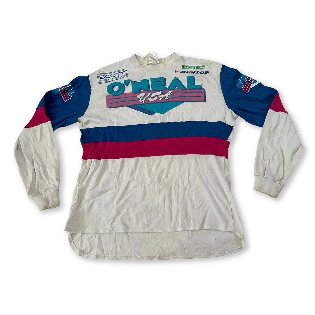
O'neal jersey 1980s
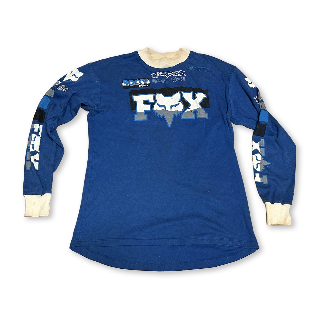
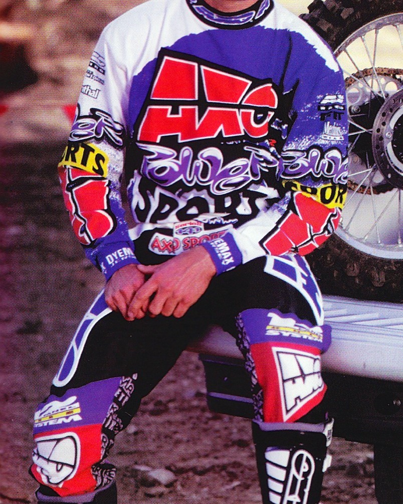
Fox racing jersey 1980s
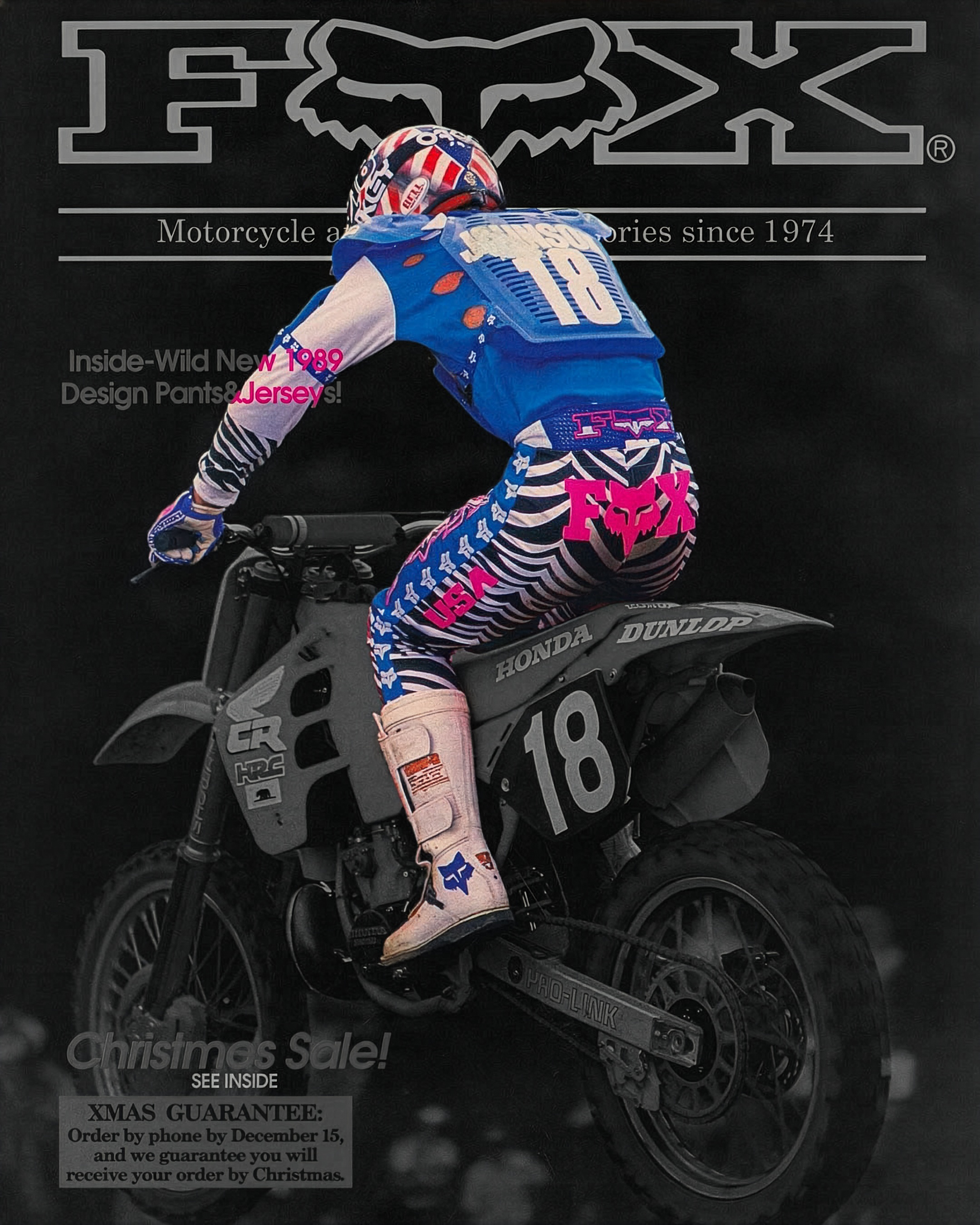
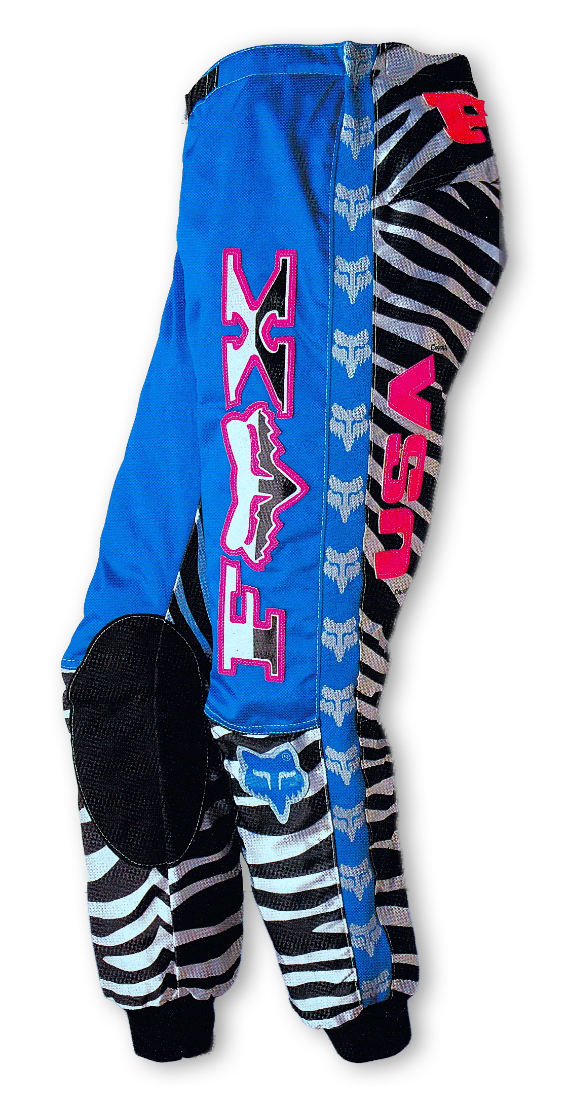
At the end of the 80s, Fox Racing released the zebra pant, which is one of the first examples of the MX2000 esthtetic taking its form,
The pants utilize a high contrast color scheme of flourescent pink and sky blue. The main visual element of the pants is of course the zebra print, referencing the elegant coat of the exotic animal. The zebra print is a staple in fasion, expressing glamour and sophistication, but recontextualized for sport apparel, the zebra print does have an interesting juxtaposed effect.
The product was the design of a 16-year old Peter Fox, which might explain the transgressive design and disregard for tradition. The pants turned out to be a great success in the end, both financially and culturally, which showed designers that taking risks with designs might pay off.
The Untold Story of How Fox Racing Became the Biggest Name in Motocross◥
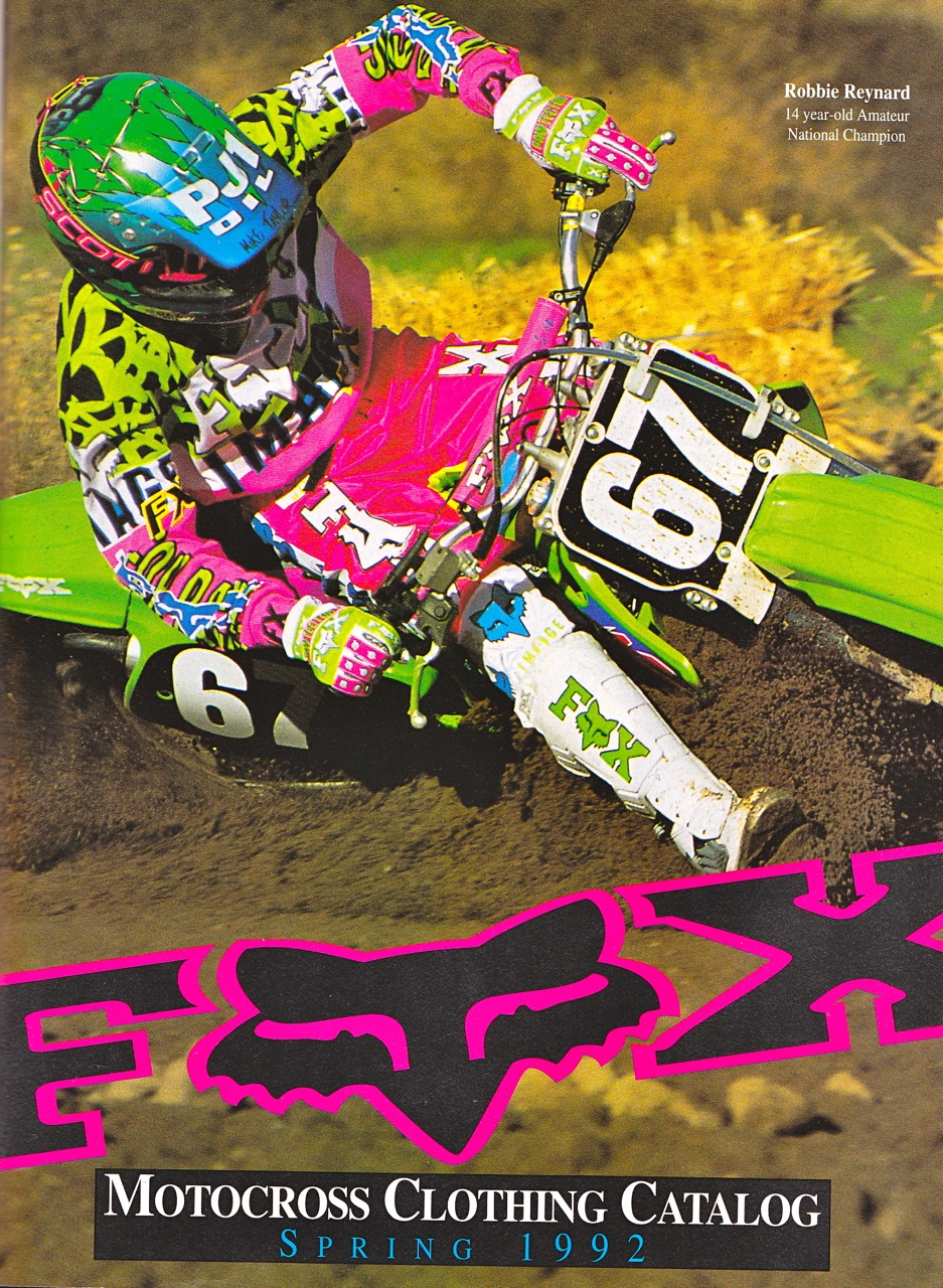
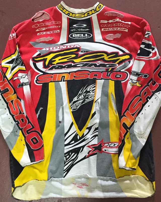
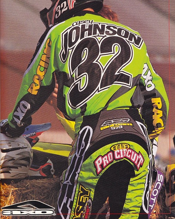
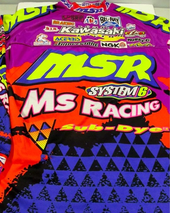
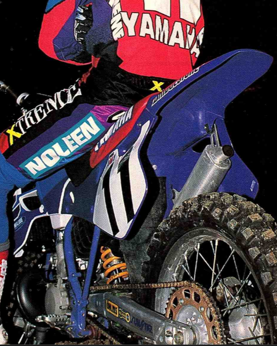
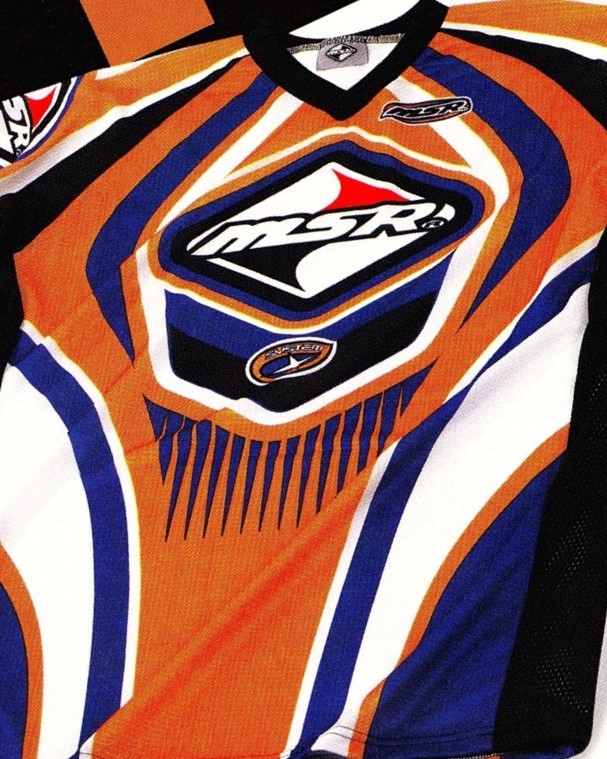
The 1990s was the golden age for the MX2000 esthetic. Now the visual design language started to really develop into new and exciting territory.
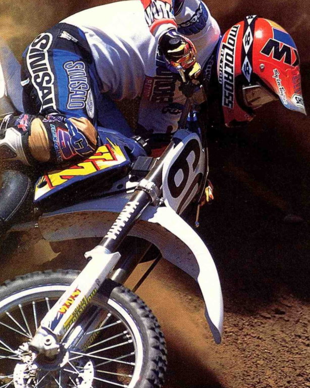
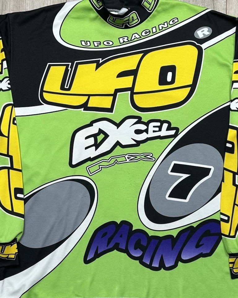
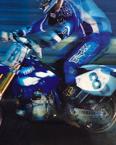
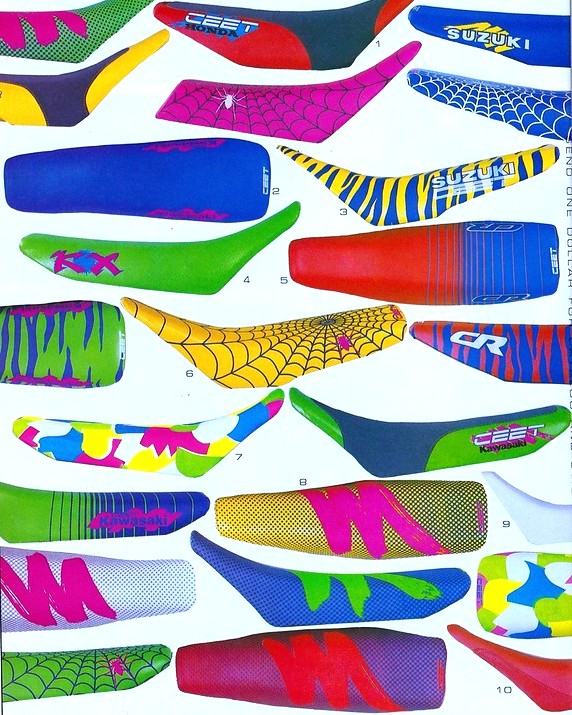
Colors became more vivid, with more high contrast color combinations, bordering on contradictory. Irreverent patterns like bulletholes, barbed wire and spiderwebs were being used on large areas of garments, combined with the expressive color palettes.
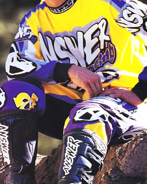
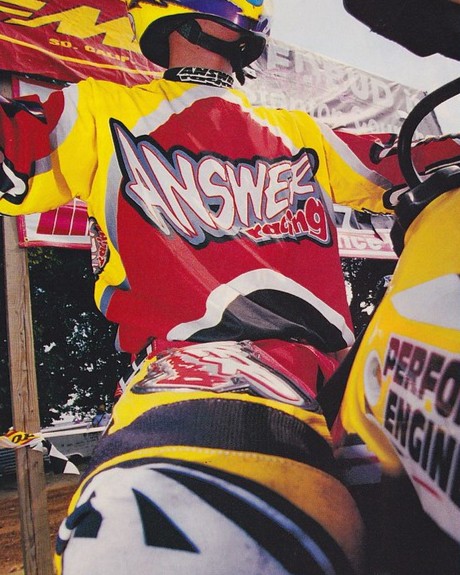
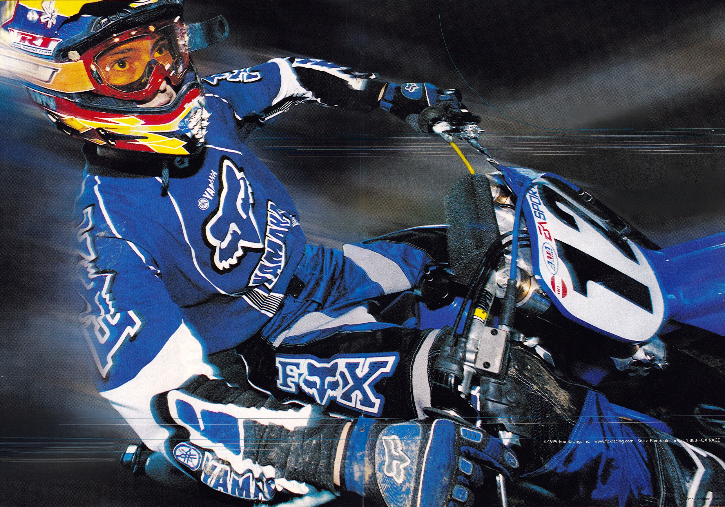
Typography was becoming even more expressive, with excessive logobombing and branding being present in most designs. Typefaces became slanted, outlined and warped, which related to the extreme movement of the sport.
Thanks to new printing techniques like sublimation printing, prints could now cover the whole garments, and be made not only with simple color blocks, but complicated and overlappping shapes. The designers of the time really pushed this technology, by adding ovelapping elements, clashing patterns and geometric shapes to their designs. Gel printing created flourescent colors,
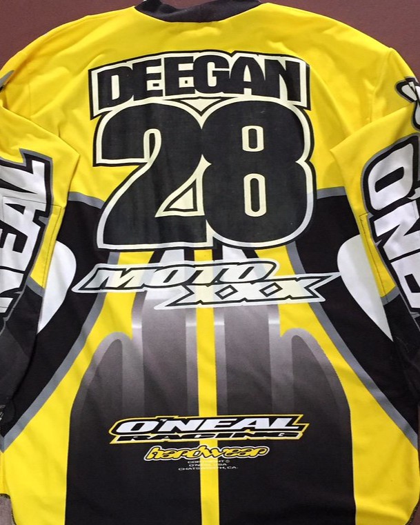
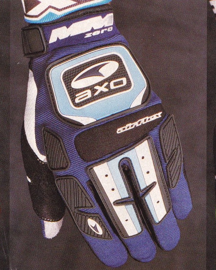
The 2000s were a time when the MX2000 aesthetic was moving away from its initial phase of exploration, towards a more standardized aesthetic which was affected by the popularity of motocross. Motocross had started to move into the mainstream, leading to old companies being bought and sold, and new companies being founded.
Companies grew too big to allow designers to improvise with new product designs and reduced exploration in favour of hiring experienced design teams. Some of the companies that were pioneers within the motocross design field in the 90s, such as Fox Racing and AXO sports had lost their drive after over a decade in the field, leading to a change in ownership.
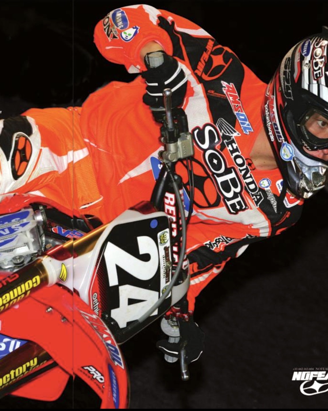
Even though the "golden age" of motocross gear was moving towards its end, the 2000s still saw a lot of very exciting visual design mithin motocross, with new trends being implemented, inspired by the Y2K era.